Genesis is the best platform to work with. It is fast, simple and SEO friendly. But there is one problem with almost all the Genesis Child Themes that their header menu is not responsive. It is very important for us to make our website mobile responsive as this is the mobile era and everything should be easily accessible from all devices. But when we open our website in smartphone or tablet then it looks bad that the header menu is not responsive at all.

So, we found one solution for this problem to help you to make your theme’s header menu responsive with just 2-3 scripts. It is quite easy to do the task. If you don’t have programming experience then don’t worry, you can still do this task easily.
Let’s get started then,
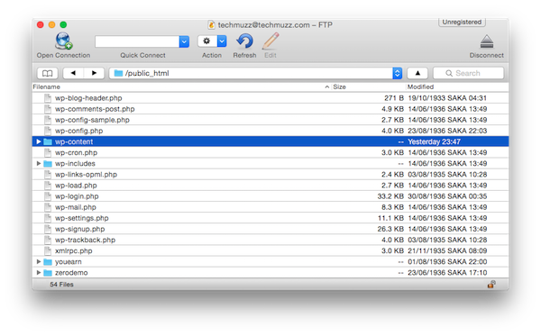
Step 1: Go to wp-content folder into your website’s root directory. I suggest to use software like CyberDuck, it helps a lot in this kind of works.
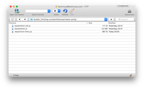
Step 2: Now navigate to the path given below. Then Upload responsive-menu.js into js folder.
/themes/your-theme/js (*If js folder is not there, then create one.)
Step 3: Put this code in functions.php
And finally, place this code into style.css of your Genesis child theme.
Step 4: That’s it.
If everything goes fine, they have successfully made your header menu responsive. Try it by either resizing your browser window or open your site into smartphone or tablet’s browser.
If you find any problem while making your header menu responsive then feel free to ask in the comment section. We will be glad to help you.
Enjoy & Stay Techie…
Thanks bro. I tried over 10 different ways to do this for my theme and none worked. Yours is perfect.
Sorry, I mean thanks sis!
certainly like your web-site however you need to test the spelling on several of your
posts. Many of them are rife with spelling problems and I find
it very troublesome to inform the truth however I will definitely come back
again.
Thank u, it works like a charm.
Can you plz share a method to put advert under secondary menu ?